The Eden Project: A paradise of … good sign writing

I recently spent a week on holiday in Cornwall with my family. One day when the weather wasn’t good enough to head to the beach, we decided to visit the Eden Project near St Austell. In case you’ve not heard of the Eden Project here is a brief summary taken from its Wikipedia entry:
The complex is dominated by two huge enclosures consisting of adjoining domes that house thousands of plant species, and each enclosure emulates a natural biome. … The largest of the two biomes simulates a Rainforest environment and the second, a Mediterranean environment. The attraction also has an outside botanical garden which is home to many plants and wildlife native to Cornwall and the UK in general.
Now, most people inspired to blog about the Eden Project would no doubt focus on the spectacle of the huge biome ecosystems, the project’s vast scale, the huge variety of exotic plants and trees, etc. and would probably show you a whole series of stunning photos such as the one I used above.
However, I’m not going to cover the Eden Project itself (wonderful though it undoubtedly is). I’ll leave that to others. What I’m going to write about here is how good the signs are.
Yes, you heard me correctly: I’m here to tell you about the signs.
You see, I work in the field of content creation, and I often hear people use the phrase “compelling content” (Heck, I use the term often enough myself), but what does compelling content actually look like?
Well, when it comes to visitor attraction signage, I think the Eden Project offers a good case study. Here’s the very first sign everyone encounters as they approach the car parking area:

There are many different messages that the Eden Project could have chosen to feature on this first large hoarding. As this is a visitor attraction, it wouldn’t be surprising to see a message such as: Be sure to visit one of our six great eateries. Or perhaps: Remember to visit our gift shop to take a little piece of Eden home with you. Thankfully, the Eden Project have put more thought into how they use their hoardings.
In just 17 words, this initial sign tells the visitor a lot about the group behind the Eden Project and what they stand for. More than this, the specific phrases used call to mind a number of further positive associations. Here is what came to my mind as I read this message:
- They are a charity — so not here just to take my money but to further their cause, which they evidently feel passionate about.
- They are run by ordinary people — not by a group of remote “experts” but by ordinary people , people a bit like you and me perhaps.
- They’re unashamedly “trying to change the world” — they are clearly a group with vision and drive and energy. They sound inspiring!
- I could join them — they seem to be actively encouraging me to partner with them. I feel included and valued and want to find out more.
See how much you can convey with just a few well chosen phrases? Here every word counts. There is no fluff, no padding. They get straight to the heart of what they are about. I find this incredibly refreshing.
After you’ve parked in one of the many outlying car parks you catch a free bus that takes you a mile or so down the road to the site itself. Then, between the bus drop-off area and the actual visitor entrance building, you have a short walk of a few hundred feet. As you proceed, you wander past a series of other signs.

This series of signs has also been really well planned. Each one has a vibrant, eye catching image and a short phrase. The phrases clearly form part of a larger message (as indicated by the ellipses) so as you walk further you get to read more of this overall message.
Here is the full message, sign by sign:
- …there should be a place…
- …that explores what a great future might look like…
- …that celebrates life…
- …and puts champagne in the veins…
- …that’s all about education…
- …with mud between your toes…
- …to hold conversations…
- …that might just go somewhere…
- …where research is experience…
- …to be shared with everyone…
- …that’s a sanctuary…
- …for all those who think the future belongs to us all…
- …then welcome to the Eden Project, home of the Eden Trust.
- That’s why we built this place and that’s where the money goes.
I love the way that the message develops and flows as you walk along. There is a rhythm and a continuity here that compels you to keep reading and that really helps build a sense of excitement and expectancy about what you are about to witness inside the site. And it wasn’t just me who thought so: most people around me seemed to be reading the signs as they progressed along the path.
Then, when you get to the main entrance building, chances are you’re going to have to queue for a while to buy your entry tickets. Contrary to popular belief, even the English dislike queuing, but thankfully here too the good people behind the Eden Project have thoughtfully put up some great signs to help distract and educate you while you wait. Here’s an example:
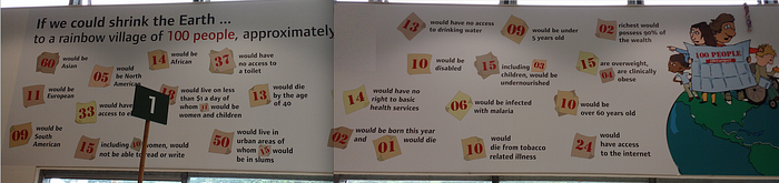
Here they have managed to convey quite a few complex issues and presented them in a clear and simple way that anyone can understand. If the statistics were given as actual numbers they probably wouldn’t impact me so much, as the information would remain fairly abstract. But when I read that 37 people out of every 100 alive in the world today do not have access to a toilet, I immediately understand the scale of the issue.
You see, how you communicate something is often just as important as what you communicate.
The Eden Project’s signs are all the more impressive when you stop to consider who their target audience is — as it’s, well, almost anyone really. The Eden Project is visited by nearly one million people each year, so the signs around the site need to appeal to a very wide range of people — visitors of all ages and nationalities, with varying degrees of interest, education, and English language competence.
And as if that wasn’t asking enough, the signs also need to be informative. After all, the Eden Project is an education charity. Oh, and they also need to be fun and engaging.
I won’t write much more, but here are a few more examples from different regions of the site:


One final photo: the last sign you see as you are exiting the site:
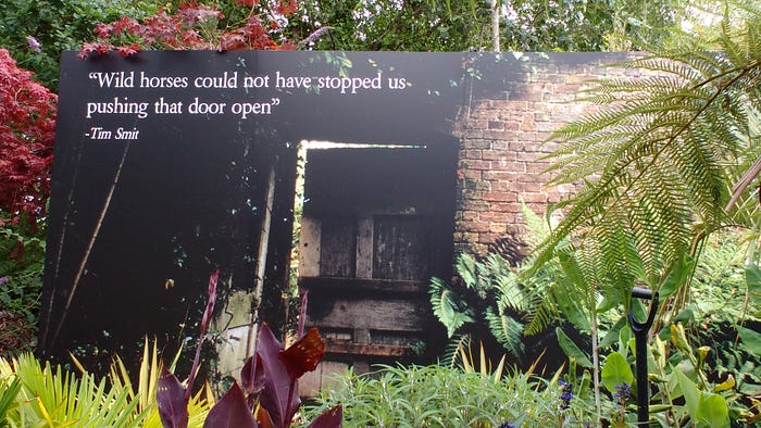
This sign is actually advertising Eden Project founder Tim Smit’s other major project, The Lost Gardens of Heligan. But again, what a compelling sign! The great image of the door ajar and the tantalizing prospect of what might lie behind it is perfectly complimented by the text.
A lesser sign would just inform me that there was another visitor attraction called such-and-such nearby, but the way that this sign has been designed does so much more: it really sparks my interest and makes me want to know more.
This is what good signs can do: they engage their audience and make them feel something. Here’s to well written signs!
Disclaimer: I do not work for nor am I affiliated in any way with the Eden Project. I simply visited as a regular punter and was impressed with the signage, so decided to take some photos and write up some reflections.
